[IC] ZP80
Inspiration
Hello everyone, we’re JOJO Design Studio – a collaborative team comprised of architectural, interior, and industrial designers.
As many of you know, custom keyboards are our “obsession,” and their owners are often collectors of various cherished objects – cameras, EDC (Everyday Carry) items, and model figures, to name a few. We’ve also observed a strong interest in lighters within our community. This led to a proposal from our fellow enthusiasts: to design a custom keyboard infused with the spirit and aesthetic of a classic lighter.
Update:
Estimated shipping date: around the end of December, 2024
Aesthetic Design Concept
Function: When you think of a lighter, its primary function – creating a flame – immediately comes to mind. This initial thought led our team to ponder: should we incorporate a working lighter into the keyboard itself? However, the safety implications of accidental ignition quickly became a concern, leading us to explore even the possibility of arc ignition with our PCB technology partner.
Form: Despite its compact size, a lighter offers a wealth of design elements for inspiration. Consider multi-stage hinges, cam-and-spring mechanisms, perforated wind guards, sliding inner bodies, the flint wheel, and the iconic graphics of various classic models. Could the nameplate or light piece echo the texture of flint, or perhaps the design language of the wind guard?
Distilling the Design: After numerous passionate brainstorming sessions, we took a step back. We realized that first and foremost, we were designing a keyboard, not a lighter. Secondly, it should possess a core essence – simplicity and usability – rather than merely mimicking external form. Finally, it needed to be a product with the signature JOJO design ethos: playful and timeless.
Design Expression:
The typical lighter’s aesthetic is characterized by a rounded, wide-proportioned, and streamlined form – which is reflected in our design by the wide bezels and generous radii. We also distilled the essential inner workings of a lighter, namely, the hinged flip-top. Visually, we favored a classic, “unadorned” aesthetic with ample blank space to provide enthusiasts with a canvas for their own creativity. The side corners are not simply a direct radius but are instead formed by three seamlessly integrated radii of varying sizes – this refinement, although increasing production costs, was necessary to ensure that the keyboard retained a strong, robust feel rather than being excessively rounded.
In essence, the shape emerged organically – flip-top upper and lower case sections, a flip-top weight, accented light pieces, a nameplate.
Structural Design Concept
As mentioned earlier, we incorporated a cam mechanism, inspired by lighters, to allow the two parts of the upper case to flip open, allowing quick access to the inner chassis.
The F-row inner chassis is designed to flip out separately, and for this, we employed a gold-plated, reinforced FPC flexible flat cable that can withstand repeated folding.
The F-row mounting plate and top case are integrated and not flexible. Therefore, we could place the connecting pins here to engage with the USB PCB.
(When you want to remove the inner chassis, flipping it open will automatically disconnect the power).
The power and USB PCBs will be pre-installed at the factory. We’ve also included a battery compartment for those skilled users who wish to DIY a wireless inner chassis.
Color Options
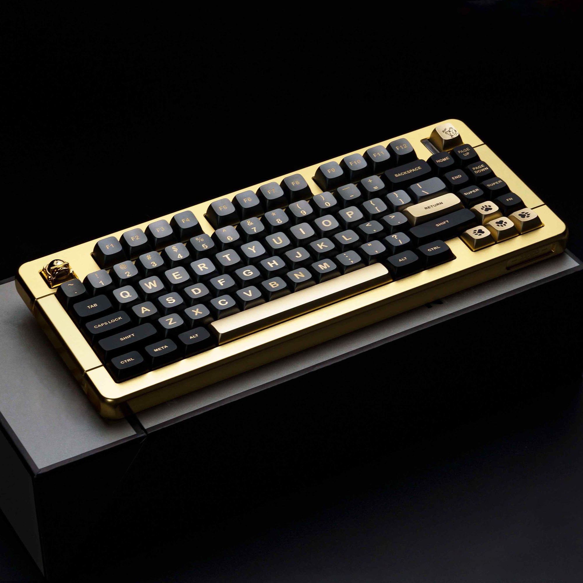
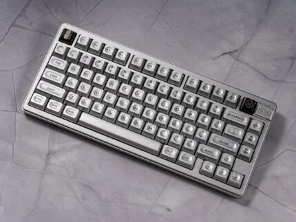
For our initial release, we are presenting two classic colors: “Sand blast silver” and “Sand blast Gold” – both inspired by the colors of lighters.
Both the Brushed Silver and Brushed Brass finishes utilize aluminum alloy with hand-brushed texturing and anodization. This particular process is fairly unique to the keyboard community,
providing a luminous visual effect and a silky tactile sensation. We’ve also intentionally reduced the coarseness of the brushed texture for better compatibility between the keyboard body and keycaps.
Inspiration
Hello everyone, we’re JOJO Design Studio – a collaborative team comprised of architectural, interior, and industrial designers.
As many of you know, custom keyboards are our “obsession,” and their owners are often collectors of various cherished objects – cameras, EDC (Everyday Carry) items, and model figures, to name a few. We’ve also observed a strong interest in lighters within our community. This led to a proposal from our fellow enthusiasts: to design a custom keyboard infused with the spirit and aesthetic of a classic lighter.
Update:
To be updated
Aesthetic Design Concept
Function: When you think of a lighter, its primary function – creating a flame – immediately comes to mind. This initial thought led our team to ponder: should we incorporate a working lighter into the keyboard itself? However, the safety implications of accidental ignition quickly became a concern, leading us to explore even the possibility of arc ignition with our PCB technology partner.
Form: Despite its compact size, a lighter offers a wealth of design elements for inspiration. Consider multi-stage hinges, cam-and-spring mechanisms, perforated wind guards, sliding inner bodies, the flint wheel, and the iconic graphics of various classic models. Could the nameplate or light piece echo the texture of flint, or perhaps the design language of the wind guard?
Distilling the Design: After numerous passionate brainstorming sessions, we took a step back. We realized that first and foremost, we were designing a keyboard, not a lighter. Secondly, it should possess a core essence – simplicity and usability – rather than merely mimicking external form. Finally, it needed to be a product with the signature JOJO design ethos: playful and timeless.
Design Expression:
The typical lighter’s aesthetic is characterized by a rounded, wide-proportioned, and streamlined form – which is reflected in our design by the wide bezels and generous radii. We also distilled the essential inner workings of a lighter, namely, the hinged flip-top. Visually, we favored a classic, “unadorned” aesthetic with ample blank space to provide enthusiasts with a canvas for their own creativity. The side corners are not simply a direct radius but are instead formed by three seamlessly integrated radii of varying sizes – this refinement, although increasing production costs, was necessary to ensure that the keyboard retained a strong, robust feel rather than being excessively rounded.
In essence, the shape emerged organically – flip-top upper and lower case sections, a flip-top weight, accented light pieces, a nameplate.
Structural Design Concept
As mentioned earlier, we incorporated a cam mechanism, inspired by lighters, to allow the two parts of the upper case to flip open, allowing quick access to the inner chassis.
The F-row inner chassis is designed to flip out separately, and for this, we employed a gold-plated, reinforced FPC flexible flat cable that can withstand repeated folding.
The F-row mounting plate and top case are integrated and not flexible. Therefore, we could place the connecting pins here to engage with the USB PCB.
(When you want to remove the inner chassis, flipping it open will automatically disconnect the power).
The power and USB PCBs will be pre-installed at the factory. We’ve also included a battery compartment for those skilled users who wish to DIY a wireless inner chassis.
Color Options
For our initial release, we are presenting two classic colors: “Sand blast Silver” and “Sand blast Gold” – both inspired by the colors of lighters.
Both the Brushed Silver and Brushed Brass finishes utilize aluminum alloy with hand-brushed texturing and anodization. This particular process is fairly unique to the keyboard community,
providing a luminous visual effect and a silky tactile sensation. We’ve also intentionally reduced the coarseness of the brushed texture for better compatibility between the keyboard body and keycaps.
